Welcome to
Becoming 2
Web Improvement Project
Exercise 1.2 - Site to improve:
TO DO LIST
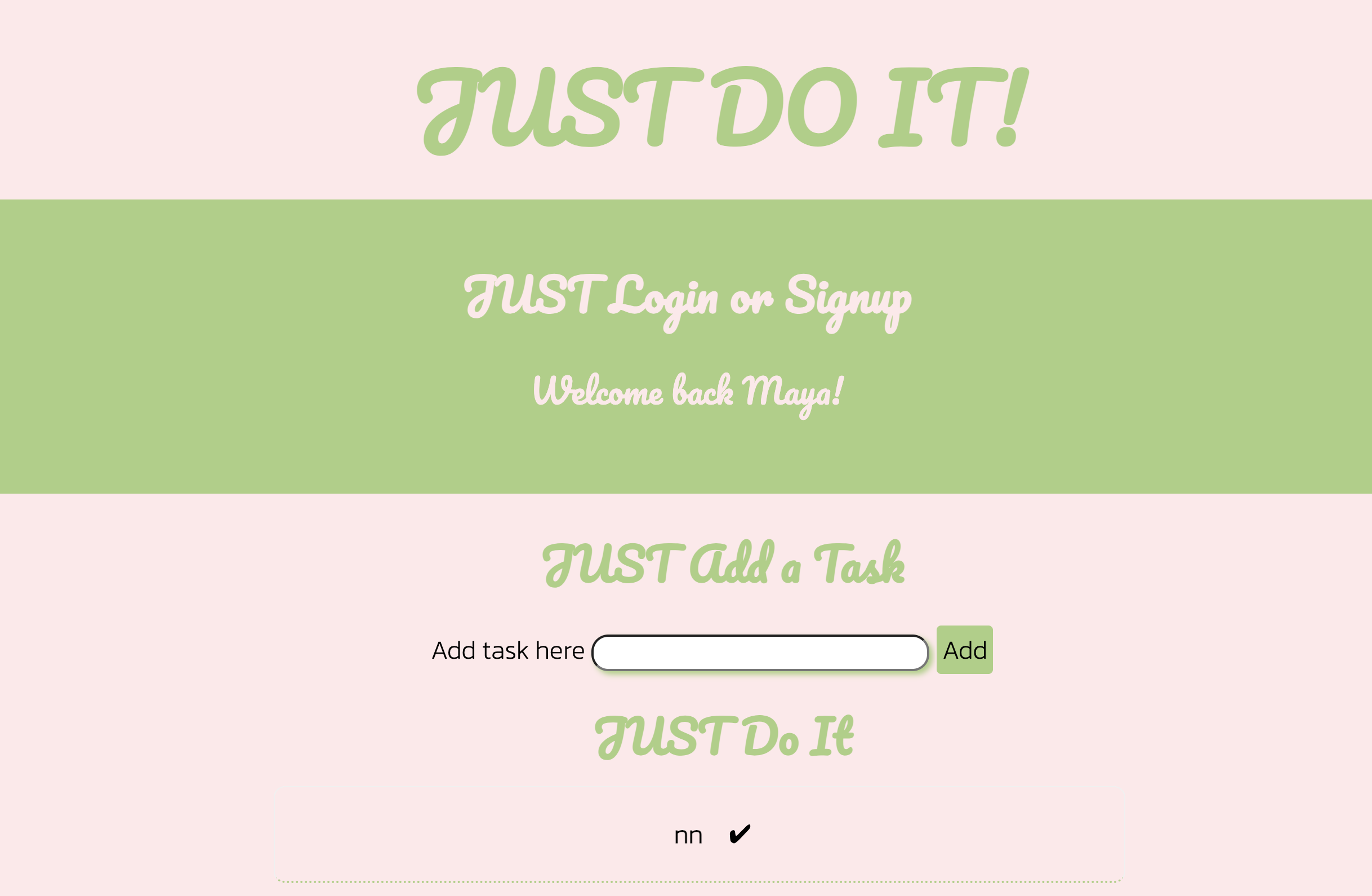
For this WEB IMPROVEMENT PROJECT, I chose my TO DO LIST APP. I want to redo the interface and redesign the concept to better reflect where I am at in my web design skills. I also think it’s an impressive website to have on a portfolio as it has UI/UX features. I think that having to reimplement the databases is going to be a challenge but I have the original working files as well as the original documentation for the different queries needed. However, I would eventually like to redesign my Passion Project in a way that fits my design style more than it did in first year. I also believe that it would be a great project to add as it showcases one of my personal interests: dreams.
The feedback that I got after group peer reviews:
The changes that I need to make:
Print Improvement Project
Exercise 1.3 - Print to improve:
PSA Campaign
For this PRINT IMPROVEMENT PROJECT, I chose my PSA Campaign - Don't Let It Tear You Down. This project is one of my favourites because I got to experiment with mixed media. I also really enjoyed this project because I got to create visuals that have a strong message behind them about an important social cause. This was designed for the DBSA to raise awarness about BPD. When I originally started this project, I wanted to have more than one person so that there would be diversity and representation but I did not have enough time to do so.
The feedback that I got after group peer reviews:
The changes that I need to make:
The changes that I made:
Video Improvement Project
Exercise 1.4 - Video to improve:
Pasitea Logo Anim
For this VIDEO IMPROVEMENT PROJECT, I chose to fix the logo animation for my brand Pasitea. This was a motion graphic exercise and I had to complete it on a time crunch with limited ressources. I want to also be able to explore different technical aspects of After Effects. I would like to add this piece to my portfolio to help support my Pasitea project.
The feedback that I got after group peer reviews:
The changes that I need to make:
The changes that I made:
Case Study
A Web Case Study for my Client:
Salon Giacomo Elle et Lui
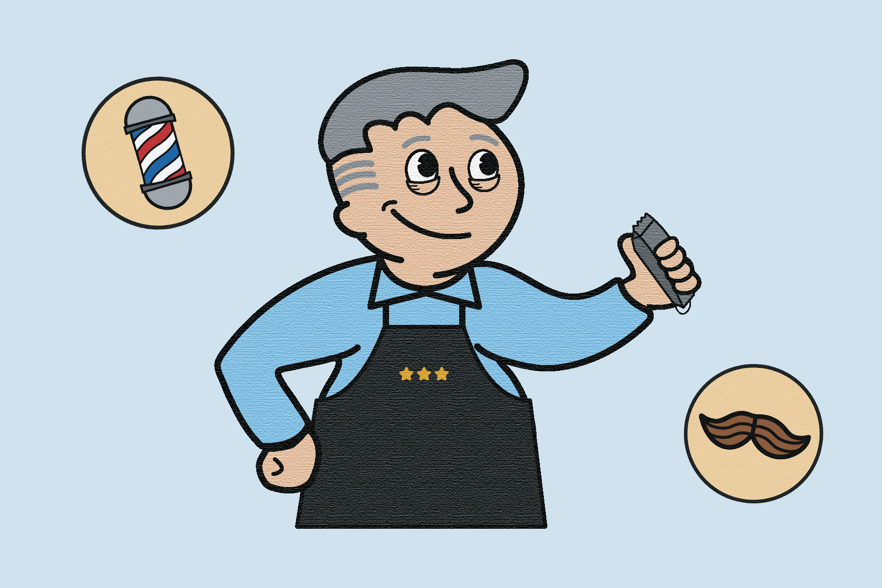
Salon Giacomo Elle et Lui is a barber shop situated in Montreal-North originating from the 1960’s. The owner and head barber, Giacomo Delle Donne, immigrated as a teenager from Italy to Montreal and opened his own shop in 1961. For generations, clients have sat in his vintage orange barber chairs and shared countless stories. Giacomo’s has been a place for the community to come together, relax, chat, and have fun over a shot of espresso.
Personal Project
An experimental typography zine:
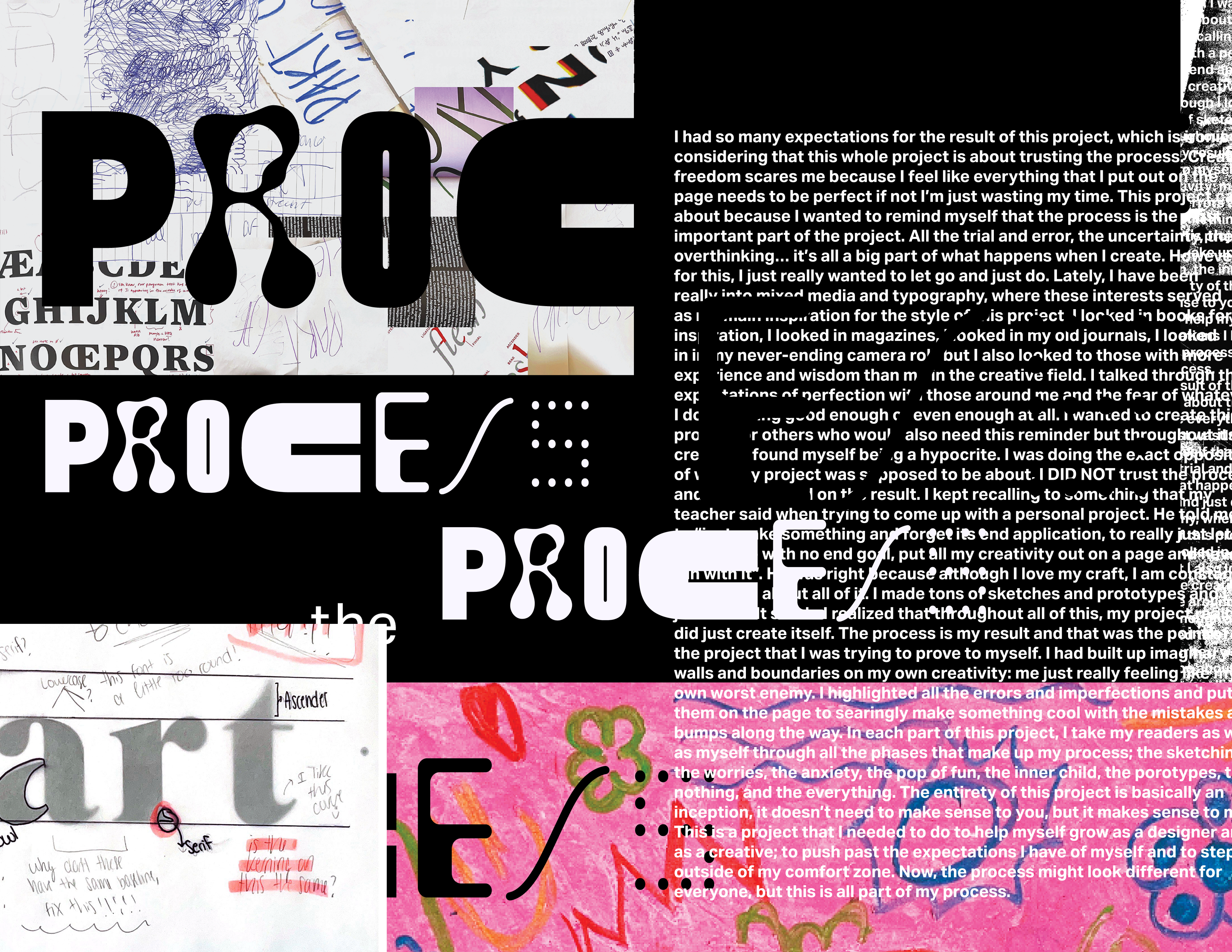
It's All Part Of the Process
This experimental typography zine is a personal project that means a lot to me as a graphic designer and creative. The whole concept of this project was to highlight the process behind the final product; turning the process into the final product.
Capyskills
The competency I chose:
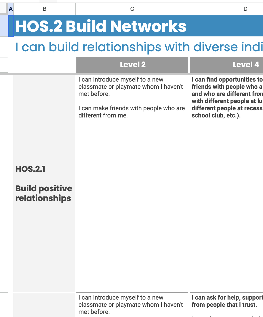
REACHED ON WEEK 9 - BUILD NETWORKS
I chose the subcompetency 2.1 and I am at level 8. My evidenece can be found on Becon.
The reason I chose this compentency and this subcompetency is that I feel as though I do not always use my network optimally. I often push networking opportunities to the side for "when I have more time". I would like to be more proactive with creatives in my field. I am also quite shy so I have a hard time reaching out and connecting with people I do not know out of the fear that I will embarrass myself. I also strongly suffer from imposter syndrome so I am afraid to seek out opportunities as I do not feel like I can complete the task.
